Now isn't this a wacky one? This is my first walk cycle facing towards the camera, and it was difficult and easy to grasp.
I began this with a few key positions in photoshop, which I initially made in my head, before using myself as a reference for the walk. I took a video of myself in this wacky position, and it was odd to say the least.
My greatest struggles came with the legs and the belly. I wanted to get the right feeling of weight in that belly of his, so I did my best to use wise spacing, which was difficult for me, because I'm not the best when guessing spacing.
Also, for the legs, I tried using my reference, and a page from Richard Williams' book, "The Animator's Survival Kit".
However, I'd say the legs did not work out very well. They feel slide like and floaty.
Oh well, this was my first time, so there's always a next time for me to update this thing or do better with the next one.
I liked doing the arms; I thought they came out pretty well for my first time.
Overall, this was a fun project to work on, and I hope that my next endeavor comes out, even better!
Behold, my newest walk cycle. I haven't done one of these in months, and decided to now take the time and do one more. This new walk is the product of watching my Richard Williams videos and finding inspiration.
Richard Williams talks about how a walk cycle can be just about anything, so I did just that. I made this angry fellow with two contact poses of his body being bent upwards, with a passing position of him being hunched forwards, and his arms downwards.
I started with those simple lines and built on my foundation from there in Flash. I struggled with inbetweens, and getting the transitions just right.
(Oh, and for your information, this entire animation is on 12s. I can see why 8s appealed to many animators in the old days.)
Another problem I had was with the arms, and the bounce of the guy's head. With the arms, I found that they were moving at ridiculous speed that seemed unnatural at first. However, after toying a bit with the idea, I feel they are moving at an appropriate place, seeing at the guy is angry he would swing his arms fiercely.
Then there was the head, when I was doing the basic shape, I found the overall bounce this guy had was fairly unnatural. he would just come up and down so roughly. Reluctantly, I left that in and continued on into making the linework of the character himself, and I'm actually happy that I did.
When linework started, I had already decided on the design I wanted to use. A bald, skinny man, with a long nose and gigantic arms suited my purposed just fine. However, I wanted to be a little daring in how I animated this fellow.
I decided to do a few illusion tricks I had learned by studying perspective. I may have been rough in how I did it, but I'm happy I took the challenge.
I made the edge of his pants move up and down to capture the sense that he was shifting from left to right, I also would move his arms from the left and right, so as to show that he is turning his body as well. And his feet aren't on a completely flat dimension. Also, his head will shift from left to right as well (going back to my talk about how I was happy with how I did his head)
It was a tough effect to capture, and even then, it's fairly rough, but I'm happy with it now.
However, I think I'm done with just flat walk cycles for now. My next one will be a walk coming towards the camera. And thanks to some papers from a teacher of mine, I'll have an easier time attempting this.
So I just started my latest full animation, after months of being out of commission. It's nothing more than a short gif really, but it works like a charm.
(I would upload it as a .mov, but blogger won't let me upload videos for some reason.)
So, I began this video on Sunday, and worked on it for about two hours. I got the idea in my head when I decided that I wanted to experiment with water for a little bit, so this was the product of that idea.
The hour before the two hours was spent conceptualizing the idea, and thinking of timing. I drew up some diagrams on how a rock would fall in the water, and how long it would take for it to drop, using video reference to help me with the timing.
I also did my best to try and understand what happens when something does splash. How does the water react? Does the rock significantly slow down when it gets in the water, or does it still go at a fast pace?
Through this, I learned that there's this thing called buoyancy; a force that pushes things out of the water, however because the rock's gravitational force (what pushes it down) is stronger than the buoyancy, it sinks. So I realize that the rock will slightly slow down upon impact with the water, and as it sinks, but only slightly.
Also, with the water, I figured that when the rock sinks in the water it creates a temporary crater in the pool. The side of this crater will shoot up rapidly, unleashing the first splash of water, and making the rings in the pool.
It's at this point, when the rock is fully submerged in the water, that water is rapidly filling the hole. So rapidly that it shoot out a huge jet of water from inside the ring, making the second splash. The water from this splash spreads out and usually will create multiple little splashes that will have the same effect.
For this animation however, I decided to take it easy with the splashing and just used a small rock at close up. However, I drew this thing entirely straight ahead, no pose to pose or extra hours put in to fix timing. But it was fun to do this and I look forward to experimenting with water again.
To all other animators wanting to try an experiment like this, I have to recommend these videos to you, they're great for understanding the nitty gritty details of how the water works.
So school is now over for me, and there is much I can talk about of the school year which kept me away. First, the final project for a video class I had. We were instructed to make a +4 minute film using a camera and over such devices.
Unlike everyone else though, I decided to work alone, with only myself and my family as cameramen. I decided I would test out some more After Effects and put some animation live action mix up to the test.
So here's the finished product.
Making the thing:
To start off, I actually didn't start this in my video class. I actually got this idea from an old animatic from my animation pre-production class.
This film was made to be as close to the animatic as possible, but it had to be stretched for time as well, along with the issues of one of the characters being a floating head.
So my goals were pretty straightforward:
1. Think of ways to stretch time.
2. Film.
3. Work out how to make animated character appear.
4. Mix audio together and record dialogue.
Step One: This was a mix of difficult and easy, as it took me about a week to think of how to extend this thing. I would come up with ideas usually on the spot, and would think of extra dialogue I could add when a situation needed it. However, my goal was to always have an extra bit of humor to the extension; it couldn't just be there to fill time or it was a waste. Some of the best gags, I feel came from the extensions, such as the face slap joke, and the commercial. However, I did find the first scene featuring me on the couch to go on just a little too long,
Step Two: This was aggravating. My mother was my camera crew for the majority of the filiming, and she had a lot of trouble understanding my instructions, forcing me to use her as an example for me to film so that she could understand it. She would often complain about the many takes that we had to do, and the many shots that went bad. However, I'd say my time with her was quite fun. Certain shots, like the character coming down the hallway, needed my sister to help make them work because the early shots were usually messed up in some way that I couldn't notice. Then you have the shots with the character alone, those are all stills I took myself because I wasn't involved in the shot. The same counts for the first walk through the kitchen with the credits.
Step Three: This part was just a little more simpler than actually taking the footage, because I actually had some experience using Adobe After Effects before. I chose for the character to be a still rather than fully animated since I didn't want to waste my time with a fully animated character, which certainly was an easier route.
During the still shots I could usually keep the guy's movement limited and let his facial expressions take over the humor department. Whenever he had to join me in a shot though, that's when trouble began. The first shot I worked with was when he tackled me and I found myself having to manipulate multiple points of the movement so that he remained in consistent enough contact with me.
Then the next shot with us together was the one where he was in front of me. Making that look fairly realistic was in all sense a pain in my ass. I needed to feather him away from my hair while at the same time making him not completely fade away or be too clearly cut. Not to mention I had to move him around with the camera and alter his mask so that he could remain consistent with my hair. It was probably the second most difficult shot to accomplish.
The most difficult shot was easily the one where he punches me. Not only did I have to make his fist come towards me, I had to realistically increase it in size as I moved it closer to the camera. And then there was that screen shaking effect that made his fist look like I cut a piece of it off with scissors. But there wasn't much I could do about that at the time sadly. Time was not on my side and I had to get this project out soon. So I proceeded to finish up the shot with the cutout fist which you can easily notice if you just pay attention to what's going on in the shot. Of course, this is my favorite shot as it leads into the K.O gag, (another extension I was happy with).
The other shots that involved him was one with a sword being over him, but that was easy to mask over using two masks instead of one.
Aside from that, the rest of his shots were never as intensive as those ones where he needed to be by me.
Step Four: First thing's first, none of that music was mine. It was all copied from popular games. The sound effects were all ripped from various sources.
The dialogue was all mine though. I was all the voices involved in the recording. I was the live action actor, and I was the floating head as well.
However, I bring this up because I ran into a big problem involving the audio in these releases. What I did not expect was that my dialogue was usually coming in too low; lower than the music, causing a lot of dialogue to be hard to hear, and mixing these tracks together a simple pain. I had to rerecord some dialogue even, because the original was in such a unsalvageable state, there was nothing I could do but that.
And I didn't even notice this error until pretty late into the process, when some music tracks were mixed with audio tracks. What a chore that was.
So for all it's worth, it was a fairly frustrating event that really exhausted me, and stole my time away from my practices involving animation and the like, but it was fun to do, and the final product isn't that bad of a mess. I won't be eager to do something like this again though, that's for certain.
This is an animatic I made for my storyboarding class. I took the time to practice with multiple perspectives, actions, and such. I also took the chance to work with special actions for adobe after effects as well.
It's the comedic failing of a duo aiming to fight for a hotpocket.
My latest post was about a week ago. I'll be back next week to talk more about the advances I've made in my studies. However, for now let me post my latest drawing.
Well well well, this was a poster that was a long time in the making, and now I intend to reveal it.
I begun this poor thing back in late February when I was developing my portfolio for college. This was one of the pieces I had intended to put in my portfolio, but due to that version being awful, I had to postpone it. Constantly tweaking and tweaking the deisgn so that i would come to look presentable. Now here is the final product. This easily pushed most of my skills in painting to the max, and I hope to create more pieces as epic as this colossus.
So then, why don't I talk about the process of developing this baby?
The design itself is not mine actually, instead I pretty much stole this design from an unused poster for the Disney film, Aladdin.
Obviously I changed a bit in design here and there, but the overall feeling is still the same. I aimed for a sense of mysticism and magic, attempting to capture a core group of characters to illustrate the many individuals our main character will come across along the way of her adventure. (If you're a die hard Zelda fan, then I've left you enough clues for you to tell who our main is.)
The smoke effect was difficult to manage, and forced me to learn an entirely new blending style just so that I could capture my desired effect. I used multiple layers for each different sets of lights, and studied golden lights for reference. Surprisingly enough thouh, there aren't as many layer effects as one may think from this piece, most of this is just natural brushes and natural color theory.
I also tried my best to give this piece more of a flow storywise. Obviously the eye will begin at the top of the layer, but as the eye follows the trail down, you'll notice that it actually is a clever little trick that eventually will lead your eyes to the logo of the piece.
Zero Point Perspective is simple enough to describe and talk about. It is when there is essentially no vanishing point to follow. This technique applies for when you are drawing a mountain range on the horizon line of a drawing, or a set of buildings.
Now you see, what prevents this part of the image from being flat is the shading. It still remains a 3D image, even if it does not follow any set path of vanishing points. Also note that these sorts of images don't have to be on the tip of the horizon line, they can also be slightly below the plot of the horizon.
Still the image does not have to apply to just mountains, but any object that lay near the horizon line and follows no real vanishing point.
And that is essentially all there is to say about Zero Point Perspective. It's a simple enough technique to grasp, but it is very easy to mess up. Be sure you know your shading techniques should you want to draw out these types of images with depth behind them.
Now onto Four Point Perspective.
So four point perspective is a technique that captures that distortion into a flat image. It's not particularly useful to use, but it's useful to know and helps for understanding perspective.
Earlier I had talked about Three Point and how you would have essentially three points. Two points would be to the side of the picture, while a third one would either point to the heavens, or down to Earth, creating a sense of an object being far below you, or going high above you.
Now in the case of four point perspective, the guideline is simple. If you are already drawing in three point you simply need to add a fourth vanishing point either to the bottom or the top of the drawing.
You simply start from the area where the horizon would be, and draw as if you were drawing your third vanishing point.
You should get something similar to this:
I find the best usage for this technique is when you want to make a drawing that makes the viewers eyes follow the distortion, like say you were drawing a tower that is supposed to be very up close to you. The bottom of the tower would be far below the horizon line and be where your feet are. Then you would make the tower rise high up to the sky, creating a long vanishing point that simulates the feeling of looking up to the sky.
And that is about everything I have to say on the subject of the perspectives. It was a long and arduous study, and I know fully well that I need to learn more for the future. Well, I can only hope that these blog posts helped any artists looking for simple advice.
I made this piece in about a week to get out material for my portfolio. While it represents a great leap in design and color, it also takes a few steps back in design.
I made this piece up as a little representational piece for a story I hitched up in my mind. A Zelda one actually, but because of my timelimit, I wan't able to really fill in the finer Zelda details, such as the triforce, and the proper dress for Princess Zelda. So I supose at this time, it only relates to Zelda in description.
I drew this out with the idea of wanting to capture size and strength with this behemoth of a dragon. I kept his body hidden, mostly because I didn't want to draw it, but instead went with the idea of him only showing his head to display his massive girth across the screen. However, I feel as if he is too flat, and not the behemoth he should be, though I'm not sure why. Whether it is the fault of the horizon or how I drew his face, I am unsure. I can only say that I want to redo it again.
The shading was something I've been practicing. Capturing a sort of paint like feel without the use of all the outlines I am used to using, along with multiple paint effects and layers using simple brush strokes to capture what I want.
Again, not one of my best pieces, but certainly a step up.
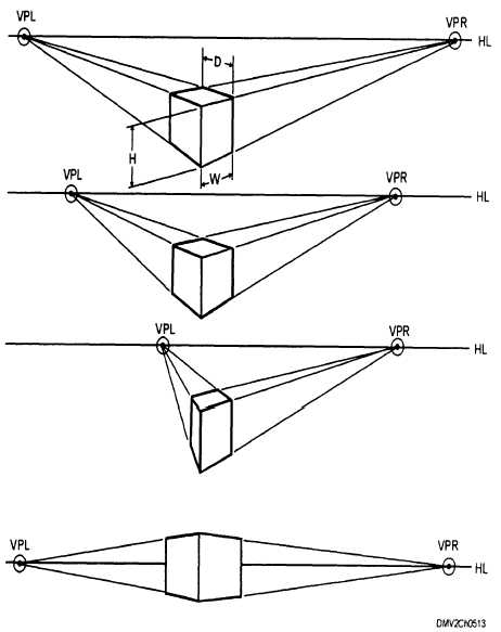
In this continuation of my study of the perspectives, I shall move on to, Two Point Perspective.
Two point perspective is little different from One Point in that it now has two vanishing points instead of one. To explain, let's take a look at these images.
Note, which side of the box is facing us (the viewer)?
Obviously, both. We are looking at the corner of the box, and we get a view of two different sides as they point in the direction of seperate vanishing points. And thus, you have two point perspective. All of the same rules as one point still exist, and I implore you to explore as many different options as you can with this type.
Next comes, Three Point Perspective
Simply put: It is a type of perspective similar to two, only that it deals in extreme highs, and extreme lows
When drawing in Three Point you begin by drawing it out as if it were two. You find two vanishing points on the horizon and begin to plot out the corner corners of the object you are looking to draw.
However, you begin to move to three point perspective when drawing out the corners of the box in your grid. This time around the corners won't be completely parallel as they were beforehand and will begin to actually head to what we call the third vanishing point.
You first find the third vanishing point by making a line from the middle corner, either up or down. From there you would have the other two corners converge onto that one line to create the effect of a great distance being either high up or down.
Remember, where you place the box matters as it will determine from what point of view you would be looking through. If you were to place it above the horizon line, you would essentially be using a worm's eye view, and if it were below the line, you'd be looking through a bird's eye view.
Of course, that doesn't mean you can't go for variation every now and then.
Take one of my latest drawings for example:
I mapped this one out on a particular angle and started with a grid that began at the bottom of the horizon line, but as the character begins to rise above the line, we as the viewer begin to see their perspective begin to change as well. We see the character's body on the upper right angle in a way that we see their features from the bottom, where as if you look at the bottom left the character's body is angled in a way that we see only their bottom.
And that's about how well I can talk about Two and Three Point Perspective. Join me later for when I finish this and explore Four and Zero Point Perspective.
I'm back, and with a new topic of study for the day. I am going to go over One and Two Point Perspective in Art.
Before I talk about Perspective though, let me drop an important definition regarding this tool.
Horizon:
We drop the word in conversations a lot, so it shouldn't be too hard to grasp it. A horizon is basically the invisible line which represents your eye level, and how you are viewing a scene. It also represents how you shall see certain objects. Take the ocean below.
In a literal sense, the horizon is that point in the middle where the ocean and sky just seem to disappear from our sight, similar to a wall. But the difference between this photo and a wall is the depth given by the horizon line.
Case in point, you know that the ocean seems to be coming closer to us as you reach the bottom of the picture? So imagine you were floating over the ocean and you happen to be seeing this same exact scene; where would the ocean eventually go? Under you, and the sky would be above.
You see, objects that are below the horizon line are always objects which you will see the top of as they come closer in and objects that are above the horizon line will be objects you can always see the bottom of.
And the way this depth works changes drastically depending on where you intend the horizon to be.
If you were to look down, you would begin to see more of the top parts of the objects that are below you.
And the same applies for up.
Now keep in mind, these images are just a basic and rough idea of what would happen. I encourage you to simply go outside and take a look for yourself. Stand somewhere high up and look off into the distance to where you can see a horizon line and begin to look up and down. You'll notice some amazing things when you pay attention.
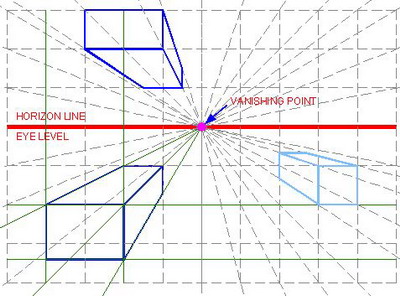
And now we have one last definition to explain: Vanishing Point
A vanishing point is essentially the one point in a perspective where everything will seem to be converging onto one area way off into the distance.
Take this road for example.
It doesn't take a genius to notice that the white lines at the side of the road look as if they are going to meet up in the middle of the road, the further and further you look, and the road also seems to be shrinking towards the middle of your field of vision.
This is a vanishing point. All objects on this road quickly converge as they move farther and farther away, until they vanish on this one point.
However, a vanishing point doesn't have to be in the distance to be one. It can also be up close.
What matters is that everything is heading in the direction of the Vanishing point, therefore, it is one.
So now you hopefully understand the nature of the horizon line and vanishing points a bit better, now we can move on to talking about the perspectives that you are capable of with a horizon line and vanishing points.
------------
I've learned of about 7 types of perspectives so far, but for now, I believe I'll only talk about five of them for sanity's sake. One Point- Perspective Two Point Perspective Three Point Perspective Four Point Perspective Zero Point Perspective One point Perspective is easily the most common of the bunch. It is essentially when there shall be one vanishing point in the entire picture that everything shall converge on. Those pictures I had shown of the wall and the road were both essentially that.
But don't be so one minded; after all, there are plenty of other ways to capture a one point perspective, as long as your vanishing point remains on the horizon, it can be anywhere in the picture. (And since the horizon doesn't have to be in a set position...)
And here is essentially how you would grid something in a one point perspective.
Just remember, everything must converge onto the one vanishing point.
So, I've been doing my anatomy studies, and am trying to wrap my head around the ideas presented to me, and I'm not going to lie, many of these concepts are not... reaching me that well. However, in spite of my confusion, I'm going to do my best to explain what I've compiled.
Note: Most of my research is exploring material that is useful to my studies as an animator at the moment. If I feel as if the study does not benefit me, I will not list it.
Today I'm going to talk about Joints.
There are immovable joints, slightly movable joints, and fully movable joints.
The most I got out of immovable joints were the sutures on the human skull.
Apparently they are held together by fibrous material, allowing for the pieces of the skull to be held together. Why they are not just one bone, I'm not sure. But they connect separate skull bones to make the shape of the skull stay together.
There was nothing interesting for me to say about slightly movable joints at this time.
The most important joints overall though, would have to be the fully movable joints, or as most of them are commonly called; synovial joints.
These are the joints that are designed to move and be moved around by your command. Though these bones have their occasional limits.
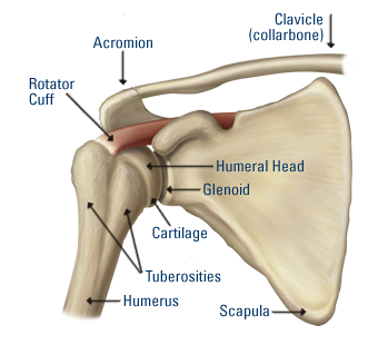
The first one I shall be talking about is the ball and socket joint.
These joints are commonly seen as the joints for your shoulder and thigh.
This joint allows for complete movement and rotation in just about any direction. The only thing they can't do in comparison to other bones, is glide.
They are only ever limited by the ligaments and muscles of your body. In certain cases, it's possible to stretch the joints past the limits. In my case, I've done this before with my arms. I would raise them to the back of my body and pull them back all the way while they are clamped together. I meet some resistance, but the process is not too painful.
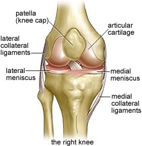
The next one is the Hinge Joint.
The hinge joint behaves similarly to how the name suggests. It's a joint that only allows the bone to bend and extend, though it is also limited by bone structure, muscles, and ligaments.
The two main users of this bone are the arm and knee.
These bones are very important for keeping our physical structure in place. For instance, if our knee was a ball and socket joint with the same amount of freedom, we would probably be unable to run or walk properly most of the time unless the ligaments were intensely strong. Though our arms may benefit from it, if the ligaments and muscles were structured enough.
Considering these joints are right next to the most freedom allowing joints, they provide a lot of limitations themselves. They define what is an effective movement or not. For starters, if one were to go in for a punch, one would not just toy around with their ball joint for flashiness. They would go for a straight punch and get it over with.
Here's a little tidbit: Note the little bulge in front of the knee. That is called the patella, it's meant to protect your joint from being harmed or dislodged, though the patella itself is not fully attached to the knee, it does a fairly good job.
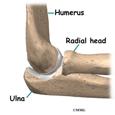
The next joint is a pivot joint.
It does just as the image claimed. It turns from side to side and little to no else. There are only three of these types of joints in the human body, one in the neck and one in both elbows.
Their sole purpose is to rotate from side to side. It allows us to turn our necks to the right and left. It allows us to spin our forearms like a drill and gives our wrist a longer twist.
Still, this is limited; One cannot turn their head all the way around or you'd snap your neck. You must physically turn your torso around to completely see what is behind you.
Also, you can't really turn your elbow too far, or you risk pulling the humerus out of alignment with the ulna and radius.
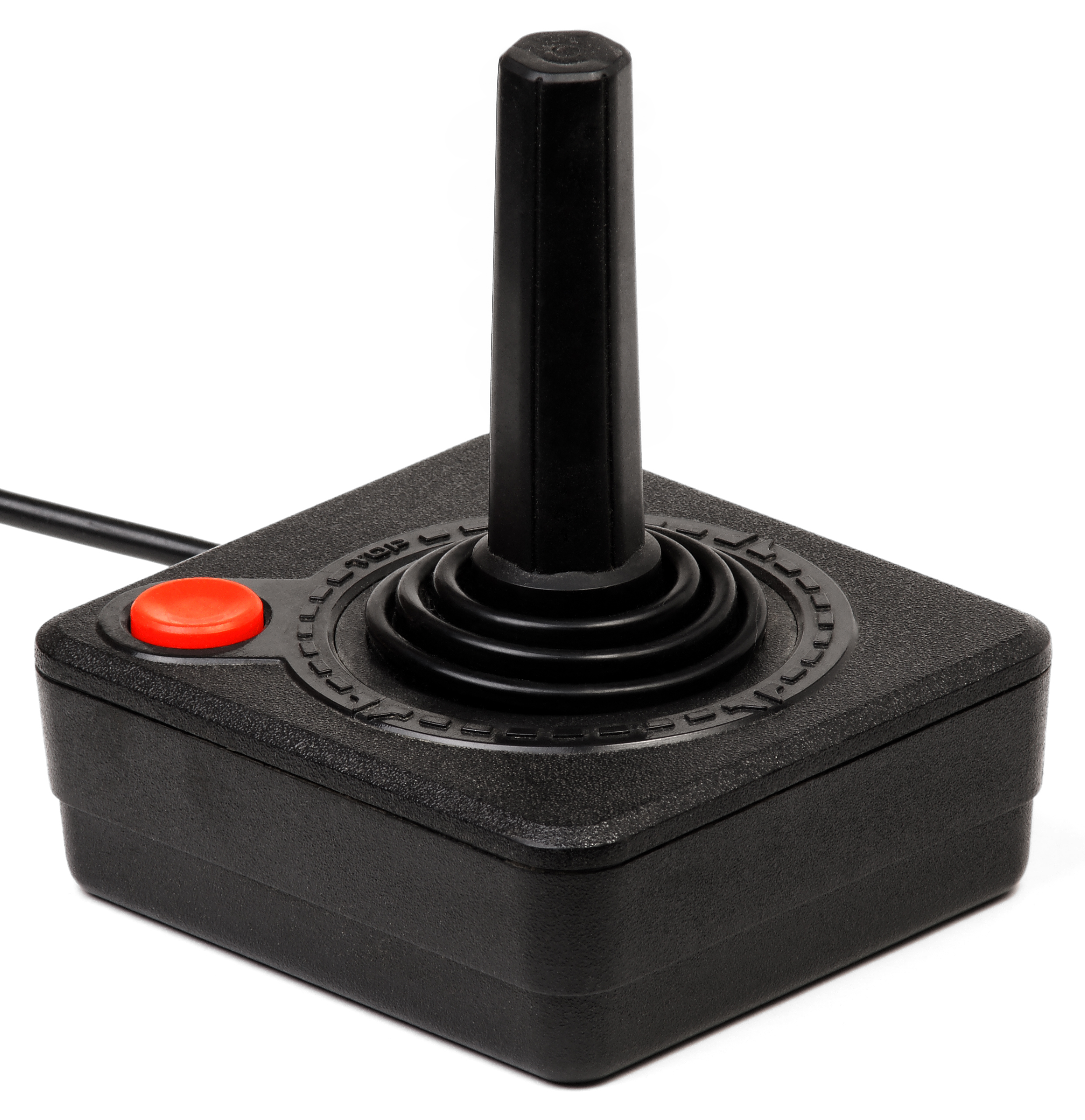
And so we come to the condyloid joints (ellipsoidal).
Think of this joint as something similar to an atari joystick.
It can move around in all directions, but it cannot rotate, and has very limited circumduction due to the ligaments and muscles that bind it together. This type of joint is used for the wrist, your fingers, toes, and the Atlanto-occipital joint in your skull.
Fun fact: You may think you're rotating your wrist, but you really aren't. Actually grab hold of your forearm tightly and you'll suddenly find yourself unable to move your wrist in any sort of rotational manner.
Your fingers essentially function as many small joysticks since they have free movement as well (and some limited rotation if you physically force them to turn). The same applies to your toes.
As for the joint in the skull, that one is actually used for flexion and reflexion and the occasional laterotation. Essentially, it's what lets you move your head up, down, and around without needing to turn it.
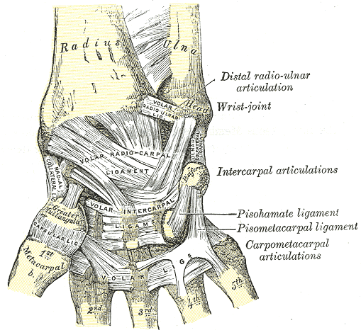
Next is the Saddle Joint.
It allows for all free movement, including the limited circumduction.
You can only really find the saddle joint in the Carpometacarpal joint of your thumb.
This joint is unique in that it offers more options for free movement than the other finger joints, being that it is the one Carpometacarpal joint we can control movement wise. It's this freedom that gives our thumb such usability to clench into our fists and claw at objects.
If the thumb were like the other fingers, it would just have a limited clawing movement that your other fingers have.
Finally comes the last set of joints. The Plane (or Gliding) Joints
These joints only allow a gliding movement, but I'm not entirely sure if I grasp the concept.
You can normally find these joints on your ankles, wrists, and elbows.
And for your own sake everybody, here's a video detailing most of what I covered here.
-----------------------------
And there you have it, that's most of my research regarding joints so far. I may actually make an anatomy animation test soon to see how well I understand how these joints work.
I've already mapped the idea in my head. It shall be a boxer, or a wrestler doing a few punches, so look forward to that, ciao.
So here I am, trying my best to implement the things I've studied into words. As I try to jot down these notes, I do my best to take them to heart. But one cannot take anything to heart if it is not made with interest. With that in mind, I have decided to put my notes together about once a week about the things I've studied on my own time, so that I may take them to heart much better.
For this first analysis, I wish to bring up the Parallax effect.
The parallax effect is a term in animation that refers to how different objects move at different speeds, depending on their place in front of a moving camera.
To bring up an example, say you were riding on a train and you happened to look out a window. You should be able to notice that objects that are closer to the window seem to be speeding by at ridiculous speeds, while objects in the distance move at almost a snail's pace. Huzah, that is a parallax.
This also occurs when you are walking forwards. Though you won't really notice; objects that are closest to you will begin to leave your field of vision in such a way that it seems like they are sliding to the side. At the same time, they will blur as they leave your field of vision, until they have fully evaporated from your sight.
However, Parallax is not the same as zooming.
This is zooming:
When you are zooming in on an object you are merely just getting a closer look at an object that is far from your vision without really getting the detail of being in front of that object. Parallax on the other hand is the effect of actually getting closer to an object, thus forth, objects in the far, far distance will not suddenly come closer to you at the rapid speed as if you were zooming, but will gradually come closer at a snails pace, despite objects in the foreground coming closer at an even faster rate.
Many years ago, this effect was achieved by using a large camera called the multiplane camera, which would capture multiple images on glass planes. Then attendants would move the planes up, down or sideways with different timing, and then a shot would be taken for each one.
Here's a great video of Walt Disney explaining the camera (in a somewhat, exaggerated fashion).


.jpg)


